By Reba Wilson
Distinguishing a Home’s Design Elements
Designers often use thematic colour schemes to cohere spaces. Texture and colour elevate an interior from basic to luxurious. This is the story of four design professionals—a duo of designers, a developer and a kitchen-designer-turned-developer—who use neutral palettes differently and to great effect.
About their preferred palette, Dylan O’Keefe and Haley Fiorenza of O’Keefe Fiorenza Design Group say they “tend towards neutrals but love a contrast.” The pair favours contrast in both colour and texture. “Wallpaper has almost taken the place of the accent wall colour,” says Haley.
A feature wallpaper has the added benefit of bringing in both pattern and texture, and is a fabulous accent. Large-scale pattern prints, grasscloth and wallpaper murals are all options. “It sets the tone for the room. With a dramatic wallpaper, the rest of the space will follow suit,” adds Dylan.
The designers also add texture using drapery, area rugs, light fixtures, mouldings and furnishings. The recent renovation of a Glebe home involved offsetting a dove blue velvet couch and graphic area rug with walls, trim, doors and mouldings painted the same shade of white. Creating continuity through painting these elements the same hue is another trend, and it doesn’t stop with white paint. A different room in that home features walls, mouldings and trim in a uniform shade of dark grey. Neutral, yes. Boring? Certainly not.
Shneur Bielak, president and owner of Neoteric Developments Inc., also prefers working with neutral colour palettes. He explains that to do this effectively, you must have a focal point in each room.
In one of his latest projects, currently under construction on Mooney Avenue, Shneur opted for a neutral theme with luxe pops of matte gold. The award-winning developer is passionate about details and stresses that “gold isn’t in. Matte gold is in.”
Though this home’s layout is open concept, each area has a distinct focal point. 3D wall panels provide textural detail in the living room. The kitchen includes leather-wrapped cabinetry, black stainless-steel appliances and concrete countertops. The counters are just one example of unusual materials introduced as a way of adding texture and drama. Stainless steel, stone or 3D tiles add dimension to walls or fireplace surrounds and are also unexpected. Shneur says inserting these kinds of finishes is like “adding a little bit of spice or flair. The best food might taste great, but if the presentation isn’t great chances are people aren’t going to order it.”
Following the food analogy, the continuity of a home must be like that of a menu: seamless, thematic and yet varied. Texture and accents are key, but flow is the most important aspect of the design. Shneur says trends may come and go but flow and quality of craftsmanship endure. Besides, accents can be changed. Though he believes metallic accents will always be in style, he suggests powder-coating cabinetry handles, doorknobs, and toilet levers when you’re ready for a change.
Though certain elements of bold design may go out of style, Shneur cautions against “builder quality beige” or a look that is too generic. You have to “use texture when you’re not using color,” he says. The leather cabinets in his Mooney design do just that, as do the glossy white cabinets in the kitchen of another of his projects on Melwood Avenue.
These two homes—situated down the street from one another—tell a tale of two kitchens. One is tactile and sultry, the other “clean and sterile.” Both are equally high in drama. Thoroughly high gloss—from cabinet finishes to the centre island’s white waterfall quartz counter—the Melwood kitchen is surprisingly warm and inviting. This is largely due to the clever lighting scheme, which includes undercounter floor lighting, as well as up-lighting above the upper cabinets. Lighting is an important factor in creating warmth in design, Shneur stresses, noting it contributes to the palette through the way it illuminates it. He prefers warmer-hued bulbs and natural lighting to stark white or blue-tinged LEDs.
Marie-Claude Quessy, a kitchen-designer-turned-developer, also favours warmer lighting. She feels lights with a colour temperature of more than 2700k leave a space looking like a hospital or cafeteria.
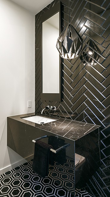
Marie-Claude has used a striking combination of white and black in her newest project on Farnham Crescent in Manor Park. The home features black-framed windows and matte black hardware throughout, from the doorknobs to the kitchen pulls. Even the railing is matte black wrought iron. With such a stark colour contrast, the precision of hues was very important to achieve the desired impact.
Tasks as seemingly basic as choosing the ecru for the exterior took consideration. Marie-Claude mentions that her team mixed the paint over and over to capture the exact “mayonnaise white” she envisioned for the stucco. Inside, the home is painted Architectural White by C2 Paint. “The canvas has to be inviting to colours,” she says. Caramel-hued hardwood floors warm up the space, as do textural elements.
“Texture is volume, texture is touch, texture is also elements that pop,” Marie-Claude points out. The black concrete fireplace surround she designed for the living room makes the space more interesting. “The texture makes it sexy. It’s like leather.”
These four professionals have their own unique ways of integrating design features to create their signature effects.