By Henrietta Southam Photos by Marc Fowler
It is a historical fact that great artists have a recognisable style whether it is through their brushstrokes or subject matter, the size of their canvas or their use of light, their choice of medium or dimension. Immediate recognition makes them not only collectable but valuable.
To the contrary, I believe a great interior designer or decorator should not have a recognisable thumbprint when it comes to a client’s home other than to finish the project within an agreed upon schedule and budget.
A great designer is an erudite guide, nothing more and nothing less.
Enter my bachelor. After a decade of renting and at the top of the private wealth management game, this art-loving, musically minded, Ivy League-educated world traveller was ready to match his lair to his lifestyle.
It started off innocuously enough. The entire four-storey home needed a fresh coat of paint if only to eradicate all the scents and smells of the previous owner’s lifestyle habits.
But then there was the carpeted staircase. To save on costs, the developer of this Barry Hobin-designed townhome in the heart of New Edinburgh had wrapped construction grade plywood treads in wall-to-bannister carpet.
This too had to go.
by Nick Bierk at Sussex Contemporary Gallery.
It quickly became apparent that for the highly sought homogenous design effect the oak wood floors should be sanded and stained to match the new oak treads and slightly different birch floors upstairs. And while we were at it, the cherry hued kitchen doors had to be switched out in an effort to at least get along with the floors. Before you could spell “miscellaneous” without autocorrect this project had turned into a full scale renovation. As every surface was to be covered by a different material, stain or pigment, the client was set free to choose a language all of his own.
There is always a point of departure in every design job and this was when black lacquer was chosen as the finish for the kitchen cabinets. This led us in a direction that spoke to the client’s love of European boutique hotels and his inclination — to quote Dylan Thomas — to “not go gentle into that good night. Rage, rage against the dying of the light.”
Against any common design sense for a townhome sandwiched between two others, we were going to smother the little light the residence had been gifted. Not only were the floors to be black and the walls to be dark grey, but the ceiling too was to be painted the same nebulous shade. In my estimation, any design decision that scares a designer is a good omen that something unique is about to unfold.
The end goal in a design concept is to hold to your ideas and ideals throughout the process. In this case the hand holding went both ways: the more the client agreed to push the envelope, the more he asked for me to see the gutsy design to its end. The trick is to not look back, not even when the work is midway done, a delicate time when nothing quite makes sense yet, when design choices may be questioned and design direction can unravel swiftly in an ungainly way.
Faith is a tenet in design. Perversely, this midway, when all surfaces were completed and the home was at its darkest, was when we started layering in the light. The liquid anthracite floors gained ivory wool hand-loomed carpets from West Elm. Patterned wallpapers by Hicks and Fornasetti from Cole & Son were hung in the living and dining rooms as was the kitchen backsplash from Euro Tile & Stone. Telescopic swivel recessed ceiling lighting was added to highlight the walls that transition seamlessly from one room to the other on one long horizontal from front to end of house. Dimensionality and textures appeared in all finishes, but did not disrupt the flow as we held to a common hue. It was my client who had me toe the line: anybody who knows me knows that color is not only my middle name it is the essence of my character. To hold to the very simple hue-only palette was blissful torture.
By the time we sat down to concentrate on the statement lighting, furnishing and accessorizing, we both realized we were having fun. Better yet, we were making music.
He labelled himself Paul McCartney and fashioned me to be John Lennon. Flattery stills gets you everywhere and I am convinced it is also still politically correct. Metals were added to the mix: gold for the gleam and silver to cool down the riff. Montreal-based Lambert & Fils lights were chosen as the home’s main lighting language. Their impeccable simplicity and high level finish assured an elegant discourse suited to the client’s character and station. Patterns were chosen to engage the senses while tone-on-tone colours ensured they were not overloaded. Geometry was sought in this home, albeit at a discreet whisper, as a nod to the client’s mathematical mind. Hicks hexagons in the living room wallpaper, M. C. Escher inspired op-art tiles in the kitchen, and circles in the Emtek square brass handles from Preston Hardware all convincingly state this is a home of a playful man with a rigorous mind.
My favorite dilemma was to outwardly manifest the modernity of this conservatively born and classically bred man. Mixing new with old is a perplexing dance but wields results when done aptly and with humour. Take for example the custom mantelpiece I designed with the same composite stone I used for the kitchen counters: the modern man-made material is a take on Carrara statuary marble. I then used classically defined Art Deco lines to shape it.
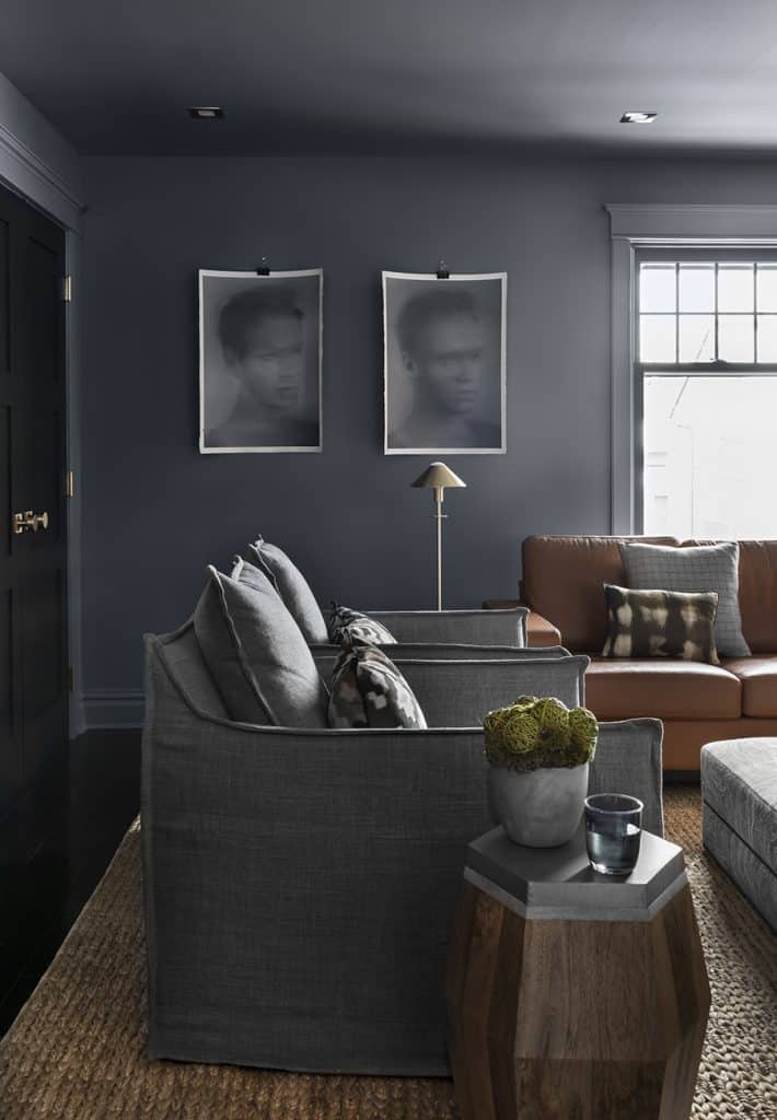
Lines notwithstanding, modern with a classic twist can also be expressed in the choice of materials: take the velvet of the living room loveseat from Cadieux and juxtapose the polished chrome base of the EQ3 swivel tub chairs, or the pairing of the brass legs of the modern dining room chairs from West Elm pulled up next to the distinctly old-fashioned oak trestle table. Mixing styles by mixing eras is another layer: take the chocolate coloured tufted headboard in the master. It begs to be called Old World stuffy, but how seriously can one take it if it sits atop a bona fide 70s inspired shag carpet injected with a swirl of light pink? Contrasting materials is also a means to the mixing end: take for example the classic cognac leather sofa in the TV room. It finds its perfect counterpart in the relaxed linen clad and outward stitched lounge chairs. Not to be outdone, the organic nature of the sisal carpet looks right at home with the sleek Kelly Wearstler sconces flanking the flat screen television.
I save my favorite mix for the last: art of all ages by all ages. No matter how different the styles or mediums employed, and to paraphrase my favorite Gertrude Stein quote: “a good piece is a good piece is a good piece.” Batman always did have an eye for the prettier pieces. In this starkly masculine but heavenly comforting lair, my bachelor’s art is the centrepiece of each room. Wonder of all wonders, nine of the 10 artists represented are not only Canadian, they are represented by local galleries in Ottawa. These include Galerie St-Laurent Hill on Dalhousie, where already established names are predominantly featured; the exciting new Sussex Contemporary Gallery, where emerging artists are not only accessible price-wise but appear in the flesh through the residency program; and the charming Studio 66 in the Glebe where artists are curated via the sensibilities of owner Carrie Colton.
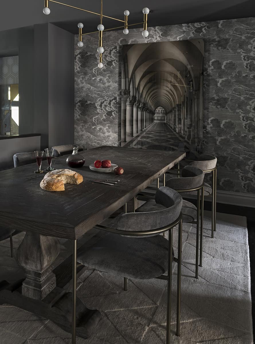
Downstairs, the Bernhardt ottoman in the living room is upholstered in a custom velvet that not only complements the trapezoids in the mixed metal West Elm mirrors, but also brings in the dusty blues of “the Spectators” by Ottawa’s own Kenneth Lochead hanging in its rightful place above the mantel. The magnificent Étienne Gélinas on the stair wall adds width to the living room by layering in depth and a focal point to an otherwise lost space. This piece was actually the starting point for the townhome’s concept and the reason black was chosen as the architectural accent color. Peter Lik’s oversized “the Cathedral” photograph was bought after the main pieces were in place. There was a debate about which size to go with as we were thinking of the space above the fireplace or in the dining room.
When the client loved how the lines of the monastic arches echoed the three dimensional kitchen tiles while also continuing the tone-on-tone of the dining table and wool carpet underfoot, our choice was made clear. Additionally, the photograph’s stone paving humorously echoes the dining room tabletop and was hung accordingly at the height best suited to lead the eye into the illusion that the table is part and parcel of the picture: by sitting at this table you become a visitor to this peaceful Venetian sanctuary, an integral player in the arresting landscape itself.
Upstairs the art was chosen after the main pieces were in place, but not before the layering of the stylish must-have accessories, with tones and textures chosen to subtly enhance the art. Take for example the watery green line in the silk lumbar cushions on the club chairs in the television room: the interplay between the Corri Lynn Tetz utopian landscapes is inescapable. A more obvious alliteration between art and space is evident in the two heads by Toronto native Nick Bierk. These were found hung precisely this way at Sussex Contemporary Gallery and it was irresistible to duplicate it. How the paper curves add to the mobility in the oil “grisaille” cameos. When I stumbled on Julia Campisi’s “Edward Weston – Nude On Sand” from her Famous Photographs series at Studio 66, it was not just the black and white iconic picture I was attracted to, it was how the artist dismantled it in linear slices, a geometric dance I knew would underscore the two-tone asymmetrical marquetry of the Anthropologie media console nearby.
The Thebes stools underneath were added after to complement the ageless linearity of the piece. Sometimes, when art is placed in the most innocuous of all spaces, including, but not limited to, the small space between the master bedroom’s closet doors, it finds its most perfect foil of all as evidenced by Dominique Fung’s “Hot Stones and Emotional Support.” This perfectly illustrates my belief that art belongs everywhere and anywhere, every time and anytime.
Ottawa has now ascertained its place as a foodie Mecca, and it would not be a stretch to say it may even be a nurturing enclave for artists, long on talent and rich in promise. If I were a resident in this best-kept-secret capital otherwise known as Ottawa, I would sit up, take note and keep a keen eye on the galleries that surround us.
My advice on how to approach the mix is simple: just start—anywhere. Then, pull it throughout—everywhere. A job done with conviction is a job done with aplomb. Aplomb has the indefinable air of uniqueness and uniqueness has a magnificent aroma of originality.
Granted my clients tend to stand out in their fields; I do not think there has been one wallflower amongst them. But, give me a wallflower and I will make it bloom.
Henrietta Southam is an Ottawa interior designer and columnist for Luxe. You can follow her on Instagram @henriettasoutham